Monday, March 26, 2018

An Update for March, 2018


Allos! I’ve been a little busy lately on several art-related things and wanted to update you guys on them before the end of the month. I’m hoping to improve my weekly habits so that I can post more frequently. I have also considered starting a YouTube channel for my various projects. As it stands, I would like to create some music for the inevitable timelapse portions before I begin. Regardless, onto what I have been working on as of late!

First, I have continued work on assets for a 3D computer game. As I wrote in the previous post, the idea for the game is far from settled, and the subject matter of my work is variable. To make the most of my work, I have been practicing new skills that can complement any kind of project!


Isabelle


This dog might look a tiny bit familiar if you have spend some time crawling the older posts on this blog. This is my parents’ dog, Isabelle, in a 3D cartoon form. I was trying to create a character that would work in a 3D platform game, and I feel that the result is passable. I enjoy working with a limited palette and using lighting that “steps” down sharply; it provides a very crunchy, Nintendo DS-like style.

But modeling characters is hardly a new process for me — I’ve worked with Blender for several years. I wanted to practice animation with this model. Isabelle, being a quadruped, is difficult to animate. Here is the result of what I was able to come up with in GIF format:


Yeah, it’s a little odd. I still have to work out more natural movement and practice animation more often.


Cat Drawing (Work in Progress)


I’ve been working on another drawing — this time, for a couple of friends. They saw the drawing of my pet snake and wanted to know if I could try drawing their cat. The picture above shows the initial pencil work. Drawing from a photograph is a fairly easy process for me, so I wanted to work a bit of challenge into the drawing. I chose to fully render the chevron pattern on the right pillow as a result. However, I was unhappy with how messy it appeared in initial pencil layout, so I reworked it before starting on the ink. I used a similar process to the one used for the bricks in this post, if you are curious.


The Scream (Adaptation)

Can be found on my DeviantArt Account, here.


And, finally, this is my completed adaptation of Edvard Munch’s The Scream. Similar to the cat picture, I drew this for a coworker who wanted “something with skulls.” I thought this image would be a neat twist on the original idea using my “surreal morbid” themes from Sepulchre and Knight.

I’m alright with how the picture came out, though I had a few hiccups along the way that impacted the final quality of the image. For instance, in the original works (there were four versions, I believe), Munch had the fjord in the background while mine originally treated the walkway like a dock — with the water in the foreground. I fixed this, but ultimately sacrificed the fidelity of the water as a result. Also, doing this left a lot of unused space in the foreground. With the major overhaul of the surrounding tones, I also lost the gnarled look of the figure’s hands — which are bent and broken like dried twigs. It comes across a little better in real life, but I think it really emphasizes my need to cease my HB-Only obsession.

Otherwise, my satisfaction with the piece comes mainly from three aspects — the figure is pale (while most of my other figures in this theme are “ashen”), the background is complete (I’ve been challenging myself to do this as of late), and the sky is actually smooth (quite a feat, given the grit of the cheap sketchbook paper).

I gave the original to my coworker shortly after its completion. This will probably end up being my final “morbid” piece — at least for a while. There is definitely more to explore in the subject, but I want to practice other, more marketable things as I attempt to begin my career in art.


I still have a few ideas for posts in the future and am currently working on another subject I’ve been meaning to tackle for a long time. I’ll update you guys when that is ready!


Monday, February 5, 2018

3D Game Asset Creation


Allos again! Today’s post will cover my work in a very different medium from what I usually write about here. Namely: computer modeling using Blender.

This is hardly my first time using the software, and I am pretty knowledgeable about its various features. However, considering that I am mostly concerned with game development, the inner-workings of its software renderer have remained a mystery to me. The reason for this is simple: my brother is writing a custom engine using C++ and OpenGL, and the representation in Blender’s software renderer is both inaccurate and mostly irrelevant for this purpose.

So, then, what exactly is it that I am aiming to achieve with this artwork? Well, as you will soon notice, I am certainly not going for a realistic art style. There are a number of reasons for this, such as my skills in modeling leaving a good bit be desired as well as the fact that realistic artwork takes a long time to produce. And I have a lot of work ahead of me as it is — this game is supposed to be something of an open-world RPG. Speaking to my limited skill and the necessity of hopefully finishing a game within the century, I am trying to stick to a comparatively low-fidelity style of artwork.

But this doesn’t mean that I am just trying to suck when it comes to the project’s art. No, there is a bit of a method behind it. Essentially, I am trying to make artwork with a quality somewhere between Quake by Id Software and The Elder Scrolls: Arena by Bethesda Softworks. As a result, the models are blocky and sharp, the textures are grainy, and the palette is a bit “funky” — metals are bluish with spots of brown, for instance.

Here are some models by themselves:

Hatchet or War-Axe


Lantern


Shield


Of the three, I think the best is the hatchet; it was the first model I made for the game and I wanted to really work to capture the style. The end goal of all of this is to create a small scene reminiscent of the apprentice mages’ quarters in The Elder Scrolls: Skyrim.


Scene thus Far…


I decided to take this piecemeal approach because I was finding it difficult to visualize the shape of the room without a good bit of clutter to accompany it.


As of now, the game is in its pre-embryonic stages (clearly), and much of this is subject to change. We might scrap the idea entirely, or stick with it to the end. Either way, I figured it would be good to write about my work in a different medium. The more intense, technical details, will come later as my brother and I continue to work on the game. I will be sure to update you all on these things as well.

Chip, damn you!


Sunday, January 21, 2018

Minor Update for January 2018

Allos again! It seemed time to finally (finally) put out an update. Work’s been a bit tough lately — I blame the holidays — and I’ve been trying to find freelance jobs that will allow me to spend more time doing what I enjoy. I also took an unneeded break from making artwork, namely because I could not find any good inspiration for things I wanted to draw. Well, things appear to be looking up in that regard; I was able to work on a number of things that expanded my horizons.

In any case, on to the art!


Exhumation
 Can be found on my DeviantArt, here.

This was another of those lunch-time sketches that I’ve been working on for roughly a month. It was inspired by videos of exhumations. I don’t know why, but I was intrigued by the way rainwater would seep into a burial vault and remain trapped there, slowly flooding the casket and leaving the body in a grim soup… That’s disgusting, heh!

In any case, this was the piece that served as my warm-up for getting back into art. I needed to draw something. I think the shaky start is visible in the quality of the piece; the dark areas have little definition and the wrinkles don’t make a whole lot of sense.  I did put a lot more work into the body beneath than is actually visible, but I lost that detail when I “flooded” the casket. I suppose there’s a bit of irony there.


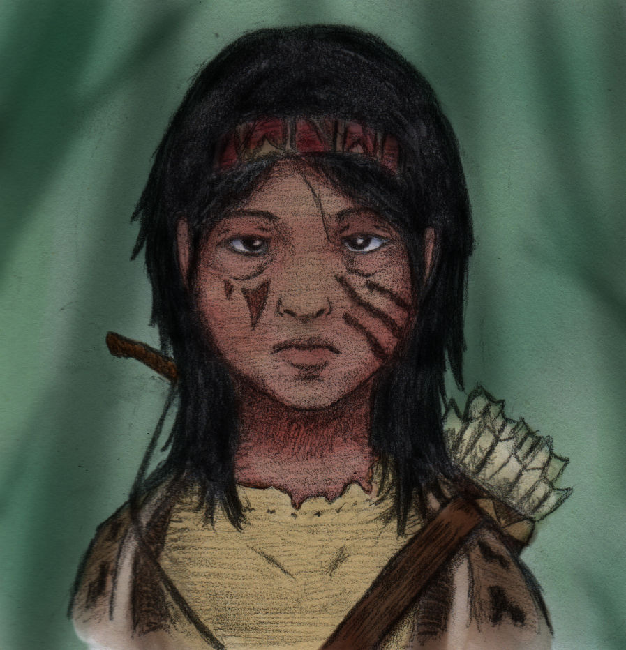
At’thania Atka (Color Version)
 Can be found on my DeviantArt, here.

O.K. To be fair, this isn’t a new piece. Rather, it’s an old one that I decided to color digitally. However, it does demonstrate my first real leap into working with color on a piece of my finished artwork.

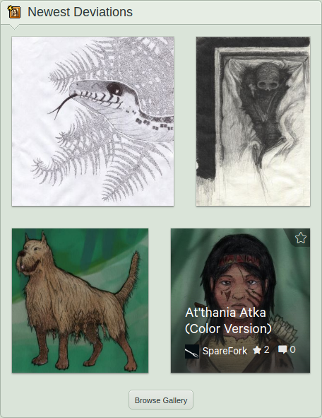
 See that gallery? Finally, some color!


It took about four hours. I used Krita to multiply in the color layers, as per the advice of numerous artists on YouTube. I also colored Magwalbi — as can be seen in that picture of my gallery — but don’t feel like I did as good of a job with it. I’ll redraw that dog one of these days, and give him a more professional style…


Slinkster
 Also can be found on my DeviantArt, here.

And this is what I spent a good few hours working on last night: an image of my pet corn snake. I did this in ballpoint pen, as per the suggestion of my brother. He really likes the look of my ink work, and I haven’t worked in the medium in quite a while. I started with pencil guidelines, as always, and completed the shading and outlines in pen. The ferns in the background, with their variable hatching took by far the longest out of anything in this drawing. In the end, I kind of like the effect they produced. What do you guys think?


That’s it for this update. I am working on some more artwork to the side of this that I hope to document here, soon. I also have a new composition method that I’ve been meaning to try out and demonstrate for a friend — I believe I’m something along the order of four months late on that one, heh!


Wednesday, September 20, 2017

Where did I go? Am I back?

There is a cruel irony to this post. I was ready to really start pounding away at the keyboard and manning the sketchbooks— I wanted to show you my working process as I started work on several projects. I even managed to pull this off with a portrait I had done for my friend. Then… silence for nearly two months.

What happened? Well, first on the list of hobby-crippling events: I moved into a new apartment with my brother and old roommate from college. This happened right at the end of July and carried through into the first half of August. Needless to say, there was a good bit of unpacking and cleaning to do; the previous tenants left us the absolutely lovely gift of an under-sink cabinet encrusted in black mold.


Yeah, my brother and roommate did a much better job of cleaning that up.


In addition to the woes of moving — nothing ground-breaking there — I visited my parents a couple of times. While that did not inherently prevent me from drawing, it did take me away from my set-up. Actually, I just forgot to bring my clipboard, heh… That and their scanner has a little story of its own, below.


It looked a bit different from this, but I'll spare you the details.

The real issue came shortly after I finished the final sketch, below. I
was having some major problems regarding my lower digestive-tract. So severe were they, in fact, that I ended up missing three days of work and going on medical leave. Yay! Time away from work that I can spend making art! Right? Unfortunately, given the nature of the illness, I was… precluded… from any of my hobbies. I’ll leave that to you’re imagination. It ended up being chronic, which is also fun.

That leave lasted about a month — the last half of August, and the first half of September — which brings us to now. I finally got that old drawing uploaded, and I managed to get something done while I was out. I’ll let you see them, below!


You can find this on my DeviantArt, here.


I am a nerd. There is no avoiding that fact, I’m afraid. And, being the nerd that I am, I joined an online role-playing site. Essentially, I can play D&D with random strangers without having to worry about coordinating a sit-down game. My character is a tribal ranger, and her companion is a large hound. I drew the dog first, using a mastiff for the pose — I wanted a monstrous-looking form — and worked in the fur of a bearded collie. A big point for me was to have the braided fur along his sides.  It's a tribal thing.  The style is pretty rough and sketchy, but I think it might be alright for a graphic novel — provided I can work out the problems with the cross-hatching.


You can also find this on my DeviantArt, here.


And here is my character, herself. I stayed up a little too late working on this one and am still trying to turn my sleep-cycle around, heh. I wanted to mix my detailed shading with heavy outlines to make the drawing a bit more “stylized,” I suppose the word would be. That’s a topic I’d like to cover some day; I have what you might call an unpopular opinion of it. Mostly, I am happy to have had more portrait practice, and D&D characters always make interesting subjects.

I should also thank my mother, as she provided me with the materials necessary to draw those pictures above. I didn’t have my truck, nor did I feel well enough to drive out to buy anything. I am blessed to have a family that cares so much about me, as well as friends and acquaintances that are all concerned with my well-being. I’m not sure if any of you will read this, but if you do, thank you.

This brings me back to the issue of the scanner. My parents use a Kodak ESP 7 All-in-One printer and scanner. As I’m sure every artist knows: printers and scanners are some of the most frustrating pieces of technology ever devised. This is doubly true for printers and triply true for all-in-ones. Further aggravating the issue, I exclusively use Linux for anything productive, and Kodak is not a decent enough company to provide drivers for the operating system. It took about three hours of work, but I got the open-source ones working — to a better standard than the proprietary Kodak photo-center-thing, might I add (smug smile) — and could finally scan things from my parents' house. Oddly, the scanner refused to function when directly connected via USB to the computer, and only worked over my home network… This is particularly befuddling because one would think scanning over a network would be the harder of the two methods. Oh well.

I’m definitely going to do a post one day about my experiences as an artist that uses Linux instead of Microsoft’s Windows, or Apple’s macOS (I think that’s what they’re calling it now). Most have actually been quite pleasant, and I would never consider returning to either of the others — particularly not Mac. No one should use Mac. It is objectively inferior both in terms of software and hardware to essentially any other offering. Needless to say, it saddens me to see that the company has entrenched its grossly over-priced products in the art community — a community that is certainly not known for its ability to accumulate wealth. I’ll stop here before the rant takes off, and I’ll share the details about why I feel this way in a later post.


This as well, here.
And finally, we get to that drawing I’ve been wanting to show you for the past two months. I was finally able to scan it and upload it after returning home. It only took about two hours to draw and finally gave me a passable result with cross-hatching. I should clarify: I can crosshatch with pen a lot better than I can with pencil. That’s not to say that I’m good at it… in fact, I think cross-hatching is still one of the weakest of my skills. But finally, I am not completely unhappy with the result. The saddest part of this entire story is that the drawing’s really nothing special. It certainly wasn’t worth waiting two months for.


That’s about it. I’m afraid. Sorry about the long post, but I felt a bit of explanation was in order. Looking ahead, there doesn’t appear to be much of anything in the way of my old, regular schedule. However, I have learned my lesson about optimism and I am not going to jinx it! Suffice it to say, I am hoping my luck holds out.


No.  It says "no."  It always says "no" unless a "yes" would be more damaging.


Wednesday, July 26, 2017

Drawing Attila the Hun


Today, I will be showing my process for drawing Attila the Hun — a drawing requested by a good friend of mine.


To start off with, I rendered out the contour lines for the figure. I decided to take the East-Asian approach to Attila, as there is a theory that the Huns originated somewhere in eastern Asia. Other than that, however, not much is known about the Huns. They were almost entirely erased by the Romans. Their language has been forgotten, save for a few words that seem similar to those in the Mongolian, Turkish, or the Altaic languages (which sucks for me, because I love linguistics and ancient languages). So, I had to take some liberties with this portrayal.

Again, I stress that this step is the most important when completing the image. No amount of shading is going to help save a bad base.


After laying out the basic framework for the drawing, the rest is actually fairly easy. In this step, I filled in the face. I wanted to get it done first, because it will end up being the focal point of the drawing.


I then finished the hair and started on the fluffy rim of his helm. Sorry about the white bar cutting through the hat — I think my scanner messed up. The hair was actually fairly easy to fill in. Though, I learned during the framing stage that the bangs had to remain high on his forehead. If I went lower with the hair, it would have looked like he had a woman’s haircut. It also helped to keep the “square” corners (the very edges above his ears) of his upper forehead revealed. Ultimately, I wish I had been able to make the hairs a bit thinner.


In this step, I completed the hat. The fluffy part of the hat was actually much easier than I thought it would be.  Other than that, the conical shape extending upward was fairly easy to fill in.


And then I moved down to the wrap of fabric around his neck, as well as the quilted pad of armor on his chest. Perhaps, by now, you’re seeing what I mean by the framing step being the most important; I haven’t done much in the following steps other than shade. That shading has been almost entirely reliant upon those lines I set up earlier. The only other thing that went into the shading was a basic understanding of how light tends to illuminate the face — those triangular regions of lighting falling from the upper cheeks to around the nose, for instance.

I also added a bit of stubble.


Finally, I filled in the shoulders with fur. I was originally going to make this a wrinkled fabric, but realized that my shading more readily resembled fur. I liked the change and thus kept it. And that’s it. A few hours of drawing — most of it spent in the framing stage — and we have this. For the final image, I cleaned off those dots of material around the head and played a bit with the contrast.


That contrast bump makes it look a bit more like it does in real life — I’ve noticed that the scanner tends to brighten the images I draw. I think I might have pushed this contrast a bit too far in Sepulchre, though. I was more cautious with this image, though, and feel that my restraint paid off.

I hope to see you in the next post!


Not much of a conqueror, eh?
That looks a bit more like a knit cap.

Saturday, July 22, 2017

Future Plans - Mid to Late Summer of 2017

It is no secret that things have been a bit dead around here… I think a spider’s building a web on my single June post, and some dust has been collecting atop those date blocks. But I’ve not been dead, I assure you — at least, no more than usually am. In fact, I’ve still been maintaining a presence on my DeviantArt account, here.

As a bit of a resolution, I am going to attempt (and ideally succeed) to increase my activity both on this site and over on DeviantArt. However, I have made the realization that I am probably not yet in the position to be giving out meaningful tutorials. After all, you haven’t seen much of my work on this website. And that’s important, if I’m going to be someone worth listening to when it comes to tutorials.

Good point...

To accomplish this goal, I’m going to make a few changes around here. First, as I stated before, I’m going to cut back on the tutorials (unless there is something that I can really help you with, like working GIMP). Second, I’m going to try to keep my posts shorter. If you can’t tell, I like to be verbose. Being verbose, however, makes posts a bit intimidating when I can only manage to free up an hour of time in a day.

Damn you, day-job!

Third, I plan to dedicate most of my posts to my projects and work (that is, instead of releasing half-baked tutorials). For now, my current projects are limited to a graphic novel — that I will explain a bit more in future posts — and an album of related artwork. The latter will be in the vein of that morbid stuff I usually draw. It will have a consistent style and perhaps some “lore” to accompany it. We will see. The idea is to, upon its completion, branch out into a different style.

Fourth, I will try to write posts about drawings that I am currently working on. I’ll also try to grab some scans of these as I work on them to show you my process. I also want to add color to my work.

See that gallery.  No color.

But the only way for me to really practice with it at the moment is digitally.

I hope you will find some of these things interesting, and I look forward to seeing you in the next post!

Now, about that dust.

Monday, June 12, 2017

Colors via Pigment and Highlighters

Colors via Pigment and Highlighters

In a bit of a diversion from the “Studying Feathers” series, I decided to explore colors. As I wrote in the first part of my “Using Values and Gradients” series, I have relatively little experience with color. Now seemed just as good a time as any to delve into the topic.

I was inspired to write this post upon looking at the color theory page on Wikipedia. Specifically, I was interested in the CMYK, subtractive color mixing diagram. Essentially, all printed colors are made using different ratios of cyan, magenta, yellow, and black ink. This goes a bit against the traditional theory that, to obtain any color, you must mix red, blue, and yellow. Mixing red, blue, and yellow tends to produce unsaturated or “muddy” colors, and usually “pure” pigments — or ones that directly resembled the desired color — were used instead of the mixtures. Put simply: if you wanted purple, you were more likely to use a pure purple pigment than a mixture of red and blue.

Today, we use CMYK mixtures to obtain all of the colors that we require, because using such a wide variety of pure pigments is impractical for the purposes of mass production. This explains why your ink-jet printer cartridges only use those few, odd colors.

Further delving into the topic, I found that this also explains those strange circles you see when looking closely at printed materials — each “channel” of the CMYK model is offset from each other by a given angle. Each channel consists of a screen of equally spaced dots aligned in a grid that, when rotated around a center point, produce circles. This is perhaps better explained by the diagram on the “Screen Angle” article on Wikipedia.

Knowing these few things, I wanted to see if I could — to some extent — replicate this effect using various traditional coloring media.


Colored Pencils


As you can see, the results were quite underwhelming. The first set of colored pencils did not have true magenta or cyan pencils. Opting for the red and blue in their stead provided the muddy colors expected by the information above. The second set of colored pencils again did not have magenta or cyan pencils either. It did, however, have pink and a lighter blue. The results were slightly better — some mixing can be seen in the overlap, but overall the results were minimally successful.

This is of course not to say that successful mixing cannot be achieved with any colored pencils. Again, I have little experience using colors in my own work. It also easily demonstrated in other artists’ works that a full set of “true pigment” colored pencils can produce an impressive range of realistic and vibrant colors. However, the success of CMYK-only colored pencils is not something that I have looked into.


Oil Pastels


Oil pastels are a distant departure from most of the media that I use. They are highly saturated and thick when applied to paper. In some ways, I would liken them to a dry form of acrylic paint due to the purity of the colors they provide.

As you can probably tell from the mixing of the “CMYK” pastels (using red instead of magenta, again due to the color not being present in my set), the results were surprisingly ineffective. The mixing was so weak that the colors appeared to overlap more successfully than combine. Obviously, pastels are meant to be blended with each other to form broad ranges of colors, and such a small region of application was not going to be suited for this purpose.

Therein lies the reason that there is an ugly, purplish blob next to this sample. I mixed the red and blue pastels to create a purple base by smudging them with my fingers and then added black to the bottom in an attempt to create a gradient. This again provided the muddy result expected by my research.


Sharpie Highlighters


I was running out of materials to test, and each of my results were rather depressing. Not wanting to give up, though, I tried one last thing: Highlighters. These, in particular, were produced by Sharpie and likely not intended for use in art.

Surprisingly, they actually mixed to produce a fairly wide range of colors.

The entire combination of colors possible using highlighters.  Also known as a "Color Gamut."

This entire range of colors was created using only the highlighters seen above. I have green highlighters, but did not use them to produce this result.

Each highlighter had a different range of “intensity” characterized by how many times it was overlapped with another layer of the same color. This explains why each range looks rectangular as opposed to square.

Put more simply, the yellow sharpie had a range of 2 (or 0-1, for the more technical readers). It was either there or not there, as adding more layers atop the preexisting yellow did not impact its intensity. The cyan sharpie had the widest range of 5 (or 0-4) intensities. And the magenta sharpie had a range of 4, or (0-3) levels of intensity.

The first range mixes cyan and yellow, the second range mixes magenta and yellow, the third mixes cyan and magenta, and the fourth mixes all three (assuming that yellow is present).

As a result, we have this wonderful mix of nice neon, and “tropical” colors that would perhaps be expected from the use of highlighters.

Ok, so this isn’t exactly the kind of color theory most artists are interested in — what colors look nice next to others, how color impacts mood, and how lighting influences colors — but it is an interesting base to the study, as printed art will necessitate an understanding of the CMYK color model. Even if you plan on working digitally, you will likely need to convert your work to this color model in order for it to look accurate in the physical world. It would make an interesting art-challenge as well — to use these three highlighters and some media for adding value to create a finished piece of artwork.

And of course, I just found it a bit interesting, heh.